
Panels
Every canvas and editor panel, what each one holds, and how docking, tabbing, splitting, tearing out and floating behave.
Reference
- Menu
- Window ▸ Panels
Panels are the dockable surfaces around the canvas. Every panel is opened, closed and toggled from Window ▸ Panels, which lists them in the order given below with a checkmark against the ones currently open.
A panel can be docked in the left, right or bottom column, tabbed together with other panels into a group, iconised to an edge rail, floated over the canvas as its own window, or closed. Where the panels sit is the workspace, and the workspace remembers every change you make as you make it.
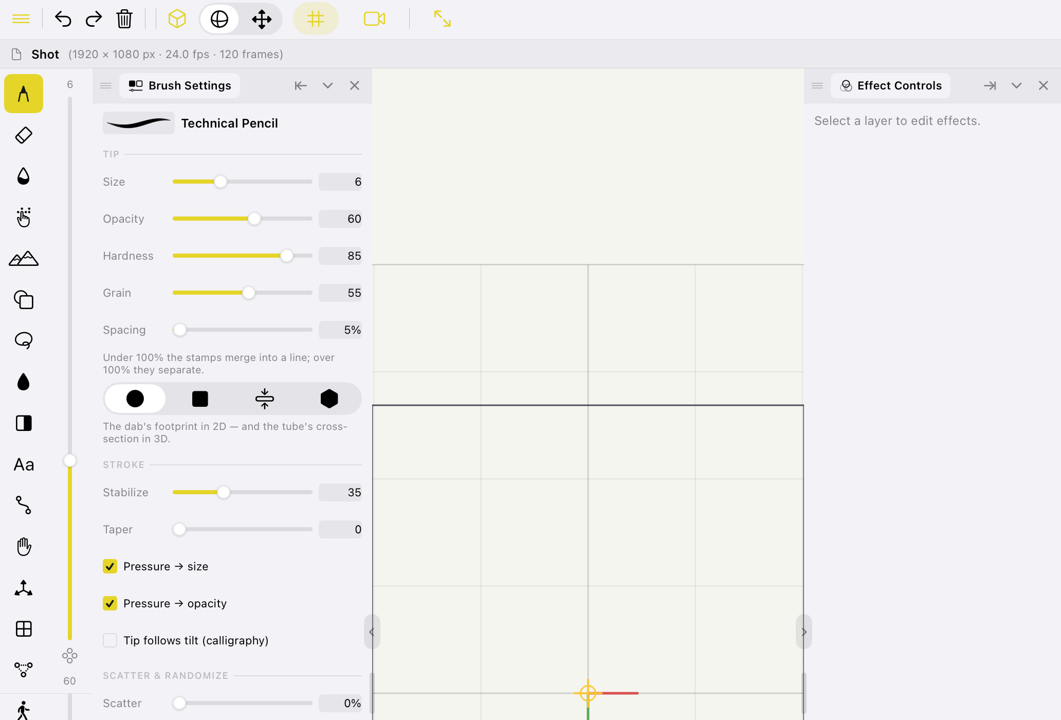
The canvas panels
Eleven panels are available while a 3D shot is open. The titles below are the exact titles on each panel's tab.
| Panel | What it holds |
|---|---|
| Tool Options | Everything specific to the current tool, in one scrolling window. Its contents change completely with the tool, and its header reads the tool's name. For Draw and Shape it also folds in Sub Tool, Brush Settings and Surface as collapsible sections, which is why those panels start closed in the Draw workspace. |
| Sub Tool | The variants of the current tool — the brush library for Draw, Shape and Vector Pen; the sculpt brushes for the two sculpt tools; Blend, Blur and Fingertip for Blend. Tools with no variants say so. |
| Brush Settings | The brush itself, in depth: Tip, Stroke, Scatter & Randomize, and Custom Brush. |
| Color | The hue ring, the saturation/value square, a hex field, a fixed twenty-swatch palette, and your recent colours. See the Color panel. |
| Layers | The layer stack — order, visibility, opacity, blend mode, groups and masks. See the Layers panel. |
| Effect Controls | The effect stack on the selected layer or group, read-only. |
| Surface | The drawing surface the active layer's grid describes — its shape and its parameters. |
| Grid Transform | Numeric placement of the drawing grid. The equivalent gizmo lives on the Transform tool. |
| Timeline | The timeline: transport, ruler and dope sheet, with cels and keyframes. |
| Camera | The view through the shot camera. |
| Particles | The preset browser and the settings for placed effects. |
A 2D shot has eight
Surface, Camera and Grid Transform all describe geometry a 2D shot does not have, so they are not listed in Window ▸ Panels there at all — a panel that opens onto "this does not apply here" is worse than no menu entry. A saved layout that still names one simply drops it on load.
Panels that grey out
Two panels apply only in a particular state. Rather than disappearing and reflowing the layout under your hands, they stay in place and grey out.
Available only in effects mode. While effects mode is active the canvas is read-only: tools do not mark, and the two- and three-finger undo and redo taps are inert. Orbit, pan and pinch stay live, so you can still move around the artwork and inspect it while an effect is open.
Available only while you are viewing through the shot camera — the Shot Camera toggle in View or on the command bar.
Default sizes
Each panel declares a minimum size, below which a splitter will not shrink it, and the size it takes when it is floated or opens a fresh column. A group is as demanding as its most demanding tab: a group's minimum is the largest minimum among the panels tabbed into it.
| Panel | Minimum | Default |
|---|---|---|
| Tool Options | 244 × 140 | 244 × 480 |
| Sub Tool | 176 × 140 | 228 × 300 |
| Brush Settings | 190 × 160 | 248 × 420 |
| Color | 188 × 96 | 208 × 170 |
| Layers | 180 × 140 | 204 × 380 |
| Effect Controls | 196 × 140 | 248 × 460 |
| Surface | 168 × 110 | 204 × 220 |
| Grid Transform | 168 × 110 | 204 × 230 |
| Timeline | 480 × 160 | 900 × 300 |
| Camera | 220 × 150 | 280 × 420 |
| Particles | 196 × 170 | 248 × 460 |
A minimum is a real floor, not a suggestion
These are measured widths — the narrowest each panel's contents can actually draw at — and the splitter will not drag a column below the widest minimum in it. Tool Options has the largest, at 244, so on a narrow screen a column holding it collapses the opposite column sooner than one holding only Color or Layers.
The Timeline is registered as a bar rather than a window: it is 900 points wide by default, it is hosted whole along the bottom of the layout, and it brings its own transport, ruler and dope sheet with it.
The editor panels
The editor has its own three panels and its own saved layout. They are entirely separate from the canvas panels — opening the editor does not disturb your drawing workspace, and vice versa.
| Panel | Minimum | Default | What it holds |
|---|---|---|---|
| Media | 240 × 200 | 292 × 520 | The project's bins — the shots and footage available to cut with. See Editing. |
| Clip Inspector | 240 × 200 | 264 × 520 | The selected clip's properties. See the Clip Inspector. |
| Sequence | 480 × 180 | 900 × 300 | The edit timeline. See Sequence. |
Like the Timeline, Sequence is registered as a bar and is hosted along the bottom of the editor layout.
Docking
A panel is moved by dragging it. Where it lands depends only on where you release it, and the target is shown to you live, on every frame of the drag, while your finger is still down. Nothing in the layout moves until you release.
What starts a drag
The three-line handle at the head of a group. Dragging it lifts the group's front panel — the selected tab — out of the dock. The drag begins after 8 points of movement.
Only the grab bar starts a panel drag. If the panel body started one, every slider drag inside a panel would rip it out of its dock.
A tab in a group's tab strip. Dragging it within the strip reorders the tabs; pulling it out of the strip tears that panel off on its own. The drag begins after 10 points of movement.
Where it lands
Release points are resolved in this order.
The panel is iconised into that rail at the position you released it.
The panel joins that group as a tab, inserted at the position under your finger.
The outer 25% at each end of the body stacks the panel as a new group before or after the one you dropped on. The middle 50% tabs it into that group.
This 25/50/25 split is what makes docking predictable without hover feedback: aim at the middle of a panel to tab, at its edge to stack.
The panel docks to that side, in the outermost slot. This is the only way to seed a column that is currently empty.
The panel floats, landing under your finger.
Group controls
Each group's tab strip carries three buttons to the right of its tabs.
Iconises the group's front panel to the icon rail on that side. The rail's flyout shows a railed panel temporarily; it is a glance, not an arrangement, and is never saved.
Folds the group down to its tab strip, leaving the other groups in the column the space.
Closes the group's front panel. Reopen it from Window ▸ Panels.
A group shows its tabs' titles while it holds fewer than four; beyond that the tabs become icons only.
Splitters and collapsing
The dividers between columns and between groups are draggable. The hit target is far larger than the five-point line you see, because a six-point target on a device with no hover is unusable. Where a column handle and a group handle overlap at a corner, the column handle wins.
A column cannot be dragged narrower than its widest panel's minimum, nor wide enough to push the canvas below 360 × 260 points.
The collapse chevron sits on the divider itself, where your hand already is. It applies to the left and right columns only. A collapsed column leaves a narrow strip behind rather than vanishing, so it can always be restored by tapping the strip — without going back to the Window menu to find it.
On a screen too narrow to hold the canvas at its minimum, the layout folds the right column first and then the left, automatically.